A Just Reality
Logo & Branding Design
For this project I created the logo and color schemes for A Just Reality. A Just Reality is “a virtual reality (VR) training prototype centered around law enforcement’s investigative response to gender-based violence.” (via pushstudio.com). Overall, I created a very human-centered logo that emphasizes the the real people affected by this technology as opposed to emphasizing the technology itself.
Research
After meeting with my client and learning more about the project I learned that they wanted the logo to be less about the tech side of this project and more about the human side. Due to this, for research I did look into what other VR companies or projects were doing but I also looked into nonprofits and women's groups to get a better understanding not just of how VR branded itself but how human-centered companies and projects branded themselves.
Process
Early Concept Sketches
When creating early concept sketches I tried focusing on creating a design that felt human as well as something that represented connection and community as these are vital parts of human existence.


Iterative Process
Once the basic concept was decided upon I attended regular meetings with the A Just Reality project team and presented my work in order to receive feedback to ensure the logo represented A Just Reality as accurately as possible. After a few iterations we decided upon the closed circle version of the logo as we felt it best represented the connection as well as the communication with victims of gender-based crimes.


Final Logo
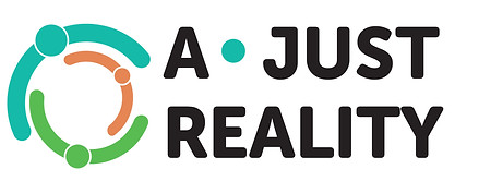
The final logo that was created is a closed circle created by three minimalist icons representing people embracing. Once the main logo was created I then designed various layouts for how the logo could exist and be used moving forward. Overall the logo represents A Just Reality well showing the empathy and open communication with the victims of gender-based violence. A Just Reality has been designed with genuine care and compassion for their user-base and this logo reflects that.


Conclusion & Reflection
I worked very closely with the A Just Reality team to ensure that the logo and color schemes truly represented their project as well the social justice oriented framework they were using. This project actually gave me the opportunity to use the empathy building skills I have gained from my time in the Community Service Scholar program during undergrad. The program emphasizes service learning and social justice which allowed me to better connect with this project. Overall, I created a human centered logo that emphasized the amount of care, empathy and open communication that has gone into this project